




Client Work: Arron Learmond
- Brand Strategy - Identity Design - Packaging - Environmental Signage -
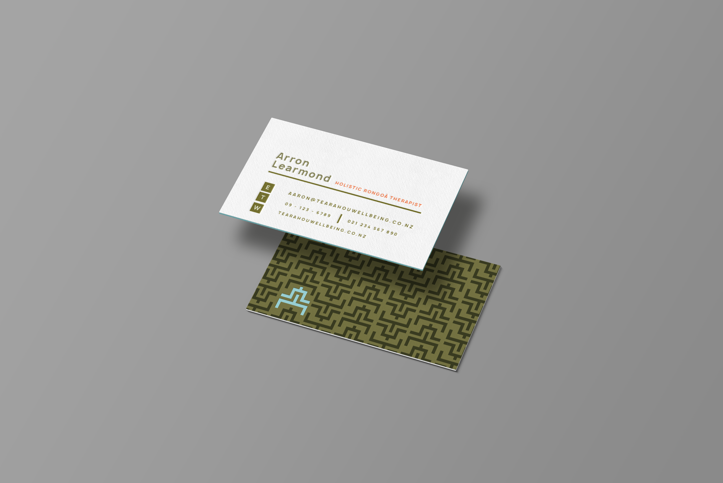
Summary:Te Ara Hou means the new path. The brand carries that meaning literally, a mark built from a pattern that has always represented the journey forward, applied to a practice that exists to help people take the first step.
Nō reira, he ara hou mō ngā tāngata katoa.